

How I built a practical property-review dashboard for a client who had plenty of good data, but needed a clearer view of what it meant.
The reports were good. Understanding them was the problem.
A client of mine owns two apartment properties and gets detailed reports from the property-management company. The reports are good. Monthly financial statements, rent rolls, bank balances, mortgage information, occupancy, weekly leasing updates, delinquency notes, turnover activity and market-rent comparisons.
Information wasn’t the issue. The issue was that it arrived in several reports, on different schedules, at different levels of detail.
Answering a simple question, like whether a property was improving or whether something needed attention right now, meant flipping between PDFs and comparing this month’s report with the last few.
My client didn’t want another report. They wanted to know what the reports meant. Which property needs attention? Is lower net income coming from weaker collections, a vacancy, a repair, turnover or debt service? Is the cash actually available, or is it sitting in tax and insurance reserves? How far are current rents from the market?
Building a property review instead of another report
I built a dashboard called Property Review to pull those pieces together, using Grok Build to create the application and refine the interface.
The goal was never to replace the property-management company or its reports. Those reports stay the source material. The goal was a useful review layer on top of them.
Property Review reads the recurring monthly and weekly reports and organizes them into one owner-focused view. It starts with the questions that matter most and keeps the supporting detail underneath.
So instead of opening with pages of accounting data, it opens with occupancy, net operating income, net income, available cash and the items that need attention.
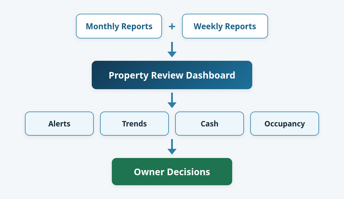
What the dashboard surfaces
- Portfolio summary: the two properties side by side, with occupancy, NOI, net income, cash and year-over-year movement.
- Attention items: vacancies, lost rent, unusual turnover costs, rising expenses, and any month where operating cash is below upcoming debt service.
- Monthly trends: a longer view of net income, occupancy, annual results and bank balances, so one odd month isn’t mistaken for a trend.
- Current operations: weekly occupancy, units on notice, collections, vacancy duration and the status of open units.
- Pricing context: market rent, charged rent, loss to lease and comparisons with nearby listings.
- Property detail: income, operating expenses, NOI, debt service, net income, reserves, distributions, mortgage schedules and expense categories.
- Rent-roll detail: unit type, rent, charges, lease dates and balances, with household information protected in the public demonstration.
What the sample report looks like
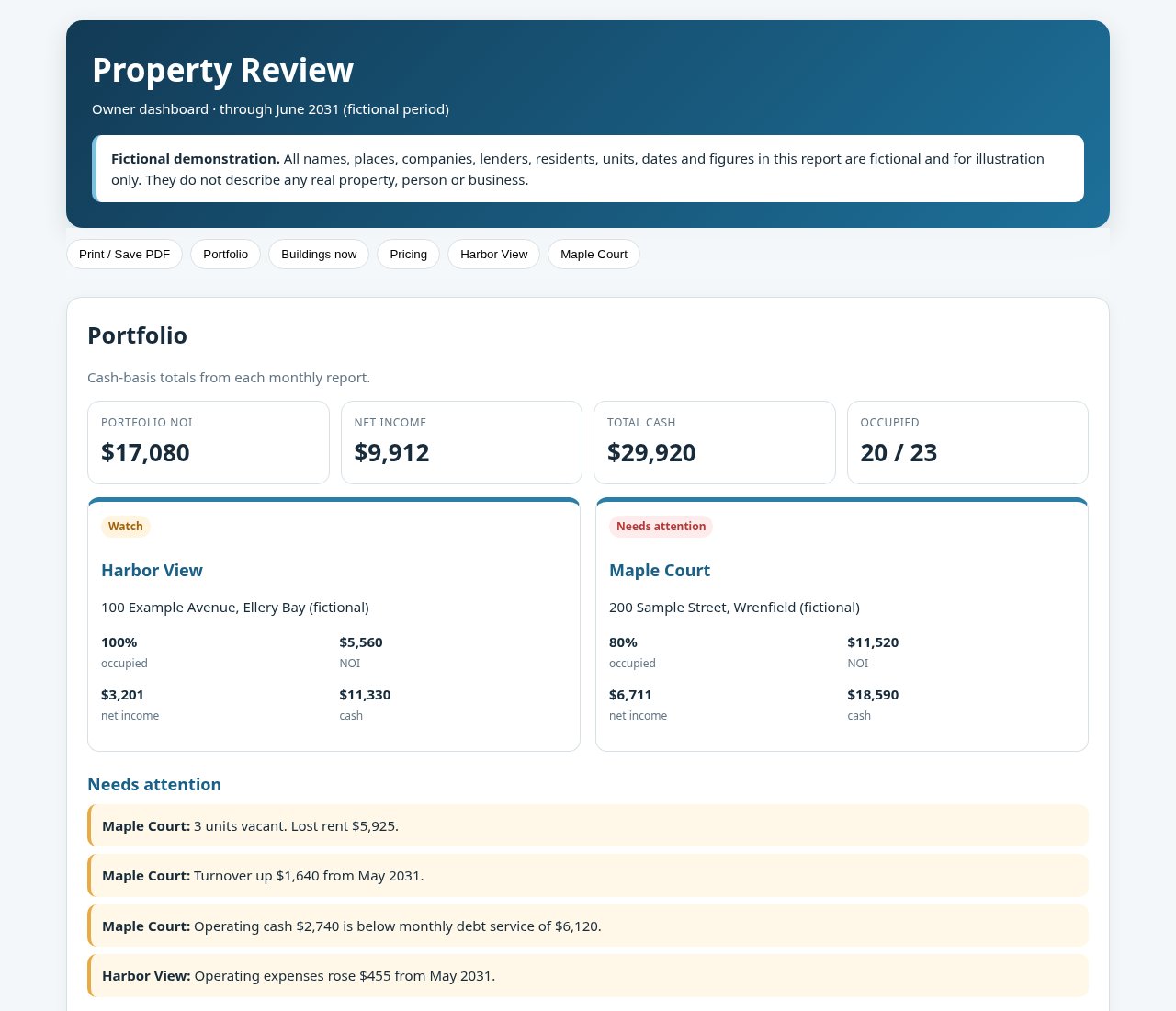
Open the Property Review demonstration (fictional data, opens in a new tab).
The sample is a single, self-contained page for two fictional buildings. The top of the page answers the owner’s first question: how is the portfolio doing this month, and what needs a look? Below that, plain-language alerts call out things like vacant units, a jump in turnover cost, expenses climbing month over month, or operating cash running short of the mortgage payment.
From there you can drill in. A “buildings now” view comes from the latest weekly report, with notes on each vacant or on-notice unit, plus any collections issue. A pricing view compares market rent with what’s actually charged. Each property then gets its own section: a short “what changed” summary, cash split between operating money and reserves, the upcoming loan schedule, where the money went, and the full rent roll.
Why weekly and monthly reports need to be viewed together
The monthly reports explain financial performance, but they look backward. The weekly reports show what’s happening now.
A vacancy often shows up first in the weekly report. The financial hit shows up later, as lost rent, repair costs or turnover expense.
Putting the two timeframes side by side is what makes the dashboard useful. An owner can see that net income changed and trace the likely reasons without rebuilding the story from several reports. The details are all still there. They’re just in an order that supports a decision.
Where Grok Build helped
Grok Build gave me a fast path from idea to working interface. I could describe what I wanted to emphasize, review the result, and keep refining the dashboard around my client’s real questions.
The key was not asking an AI tool for a generic dashboard. It was giving it a clear job: preserve the detail in the source reports, calculate and compare the right values, explain what changed, and make exceptions visible.
I still had to do my part. I checked the source figures, nailed down metric definitions, and decided what belonged in the summary versus the supporting detail.
That split worked well. Grok Build sped up building the application. The reporting logic and my review kept it grounded in the client’s actual documents.
Using a different AI to review the results
I didn’t stop at the first version. I handed the dashboard to Microsoft Copilot and asked it to review the results and suggest changes.
It sorted its notes into what was working and what to fix next. It liked the “Needs Attention” list, the “What Changed” summaries and the vacancy detail.
It also flagged a few fixes. One chart showed raw field names instead of clean labels. It suggested splitting urgent problems from opportunities, adding a portfolio total card, showing spendable cash apart from reserves, and tucking reference detail like mortgage schedules behind a click.
The best advice was the simplest: polish the first screen before adding more features.
I gave those notes back to Grok Build to make the changes. One AI built it, another reviewed it, and I decided what stayed.
A few lessons from the project
Good source reports can still create an information problem. Detailed reports are valuable, but owners often need a separate layer that explains relationships, trends and exceptions.
The summary should point back to the evidence. Every alert should be backed by the underlying monthly statement, weekly report, rent roll or loan schedule.
Definitions matter. NOI, net income, operating cash, total cash and bank balance are related. They are not interchangeable.
Exceptions beat another wall of numbers. Vacancy, delinquency, turnover, expense increases and debt-service pressure deserve top billing.
AI-assisted development still needs review. Calculations, labels, source mapping and narrative conclusions all have to be checked against the original reports.
Give different AIs different jobs. Grok Build built the dashboard. Microsoft Copilot reviewed the results and suggested changes. A second AI looking at the work flagged fixes the first one didn’t.
Don’t let an AI grade its own work. Before the demo went public, one AI went through the file and found real figures hidden in the chart code, where a read-through would miss them. Another AI made the cleaned copy, and a separate one checked it with a script, not by reading it over. Nothing went up until both checks came back clean, and I still made the final call.
Keep the client’s data on the client’s machine. Property Review saves the client’s files and reports on the client’s own laptop, and the app itself doesn’t expose anything to the internet. Every figure in the sample report is made up and deliberately unrelated to the real numbers, so nothing in it can be traced back to the actual properties.
The result
The finished dashboard gives my client a much faster way to review the portfolio. It doesn’t claim to predict the future, and it doesn’t replace accounting or property-management judgment. It makes the existing information easier to understand and turns a pile of recurring reports into a consistent review process.
For me, it was also a good example of practical AI-assisted development. The value wasn’t a flashy chatbot or a generic summary. It was a focused tool built around a real workflow, using reports the client already trusted.
I created a demo version of Property Review with fictional properties and made-up figures. It shows the same structure and level of detail as the real dashboard without revealing anything about my client’s properties or residents.
The takeaway
If you’re getting strong reports and still struggling to see what needs attention, the answer probably isn’t another report. It’s a better review layer.
The best dashboards don’t hide the details. They make the implications easier to see.
If you’re sitting on recurring reports like this, in property management or anywhere else, and want a tool that turns them into decisions, let’s talk.